BACK TO TOP

Design Analysis

Purpose Statement

Amazon is one of the biggest top Internet retailing company in the world. They describe their purpose statement as: "To be earth's most customer-centric company; to build a place where people can come to find and discover anything they might want to buy online."

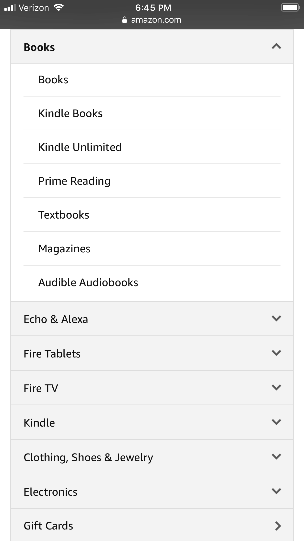
Image demonstrating proximity on Amazon's website

Proximity

Cameron Carlsen

With this screenshot of the site, we see that when the user presses BOOKS, the dropdown list of many books comes to view. This is an example of good proximity because it allows the user easily find the book they are looking for, and they don’t have to search all over the place. All the books are placed closely together. A bad example of proximity is if the site threw random products throughout the site with no grouping.

Alignment

Cameron Carlsen

The alignment shown on this page is very easy to look at and see what you are shopping for. The left aligned side is pictures of different products that you searched, and the right side shows information of the product price, reviews and other information. The alignment guides your eye to what you need to see.

Image demonstrating the principal of alignment on Amazon's Website

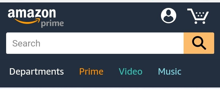
Image demonstrating the principal of contrast on Amazon's Website

Contrast

Leah Western

Amazon's navigation bar is a really good example of contrast. They have a dark blue background and lighter text, logo, search bar and other buttons. This contrast makes it very easy to see all the navigation parts. The navigation tabs are further contrasted by each on being a different color representing a different section of their website. The different colors also draw attention to the tabs.


Typography

Leah Western

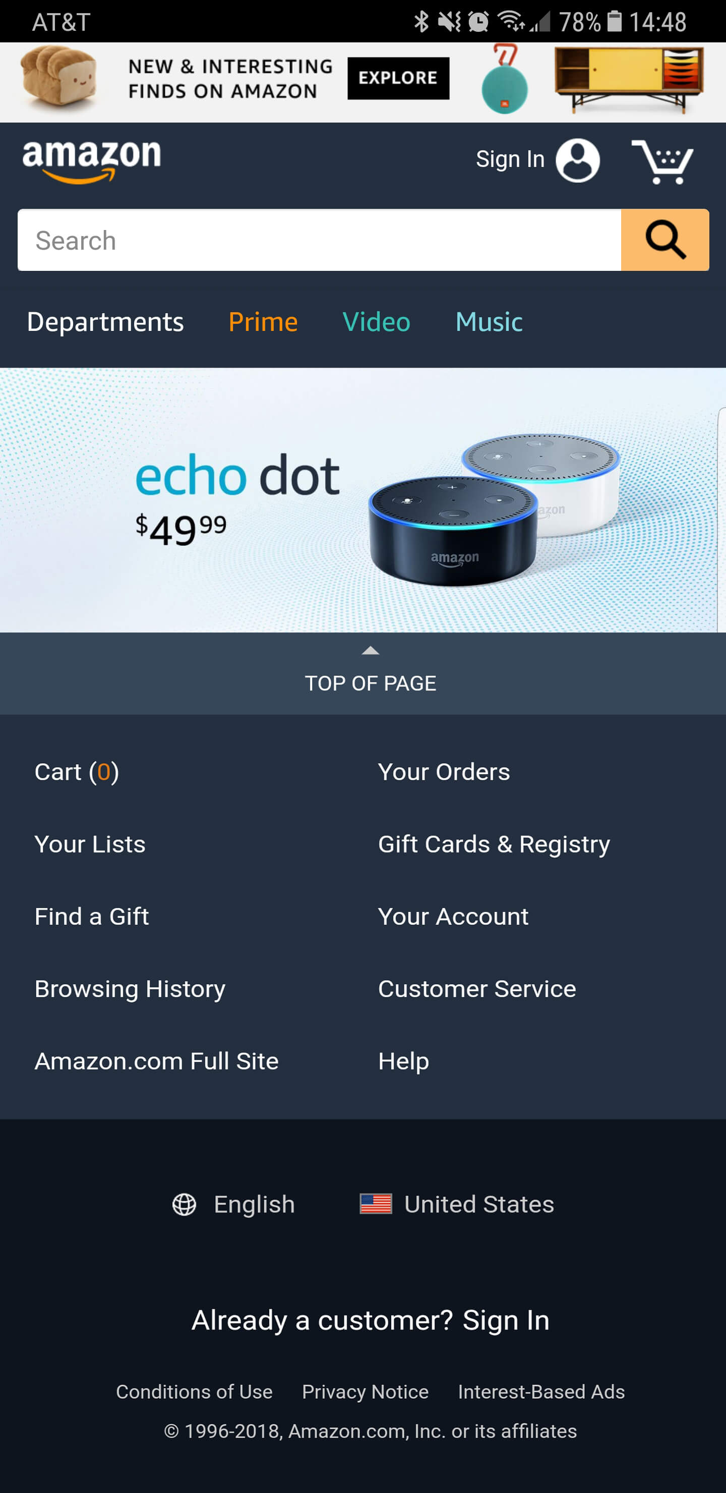
Amazon has very simple but clean typography throughout their website. They use a simple but modern sans serif font which is targeted toward their audience. It is easy to read all the text on the website, as shown in their footer.

Image demonstrating the principal of typography on Amazon's Website

Image demonstrating the principal of repetition on Amazon's Website

Repetition

Sidney Rodrigues

When talking about websites repetition is extremely important, for an example the links. It can help the user find different ways to get in the same place. As we can see in the screenshot we can find the cart both on the menu and in the footer, the same happens with sign in.


Target Audience

  • Age: 14 and up
  • Gender: Both male and female
  • Location: World-wide, but mostly developed countries
  • Income: $5,000 and up
  • Occupation: All, special deals for students
President Eyring Picture Full

Persona

  • Name - Steve Wilson
  • Age - 27
  • Occupation - Recently married accountant
  • Primary Device - Iphone X, Macbook Pro
  • Quote - I love Amazon, because I can buy all the things that I love in one place and cheaper than other places.